Logos: the iconic mark
Offering 25% off all services for the summer! Book a call with me here.

© Akina Huey
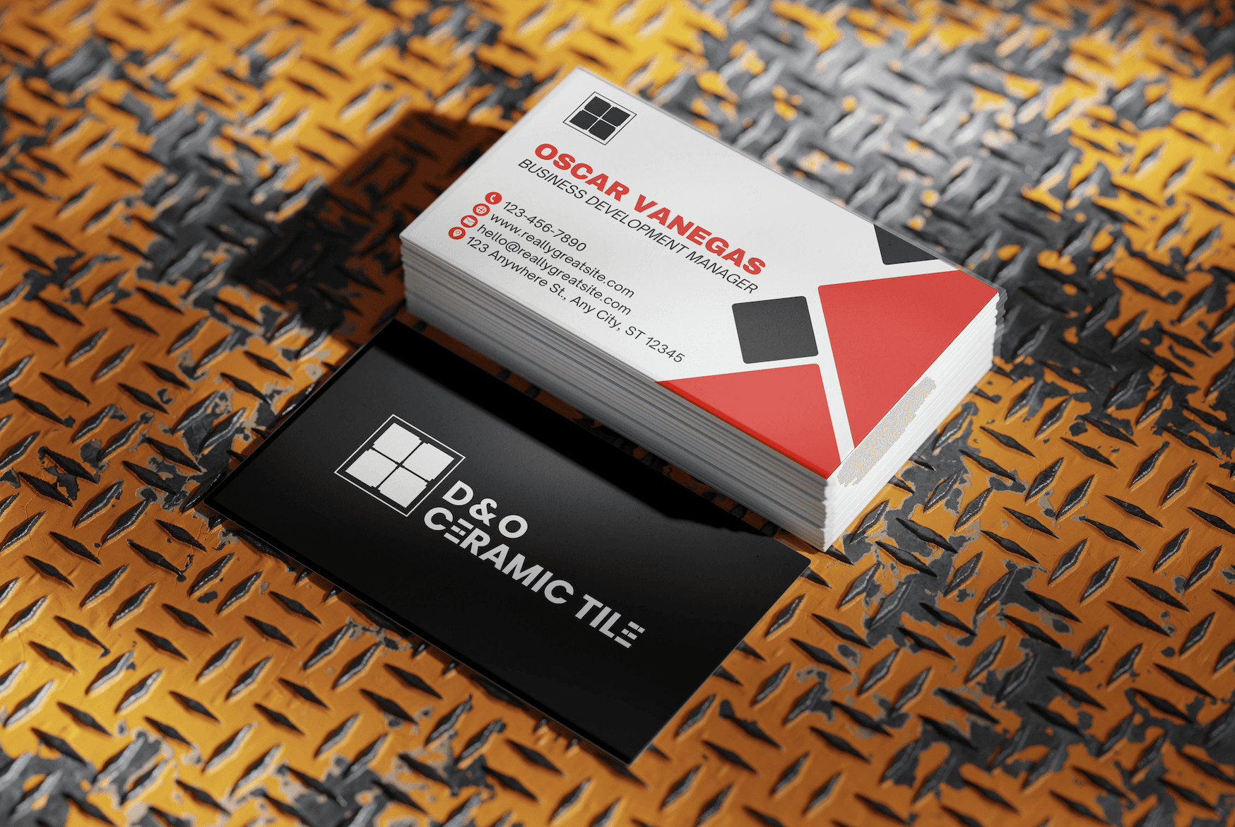
D&O Ceramic Tile
D&O Ceramic Tile is a family owned business based in Atlanta, GA with over 20 years of tile installation experience. D&O has built its reputation through word-of-mouth and Facebook referrals.
They sought a refreshed brand identity to bring a more modern, flexible, and cohesive look to their business. The goal was to evolve their visual presence while staying true to their core mission: delivering high-quality installations at the best price.
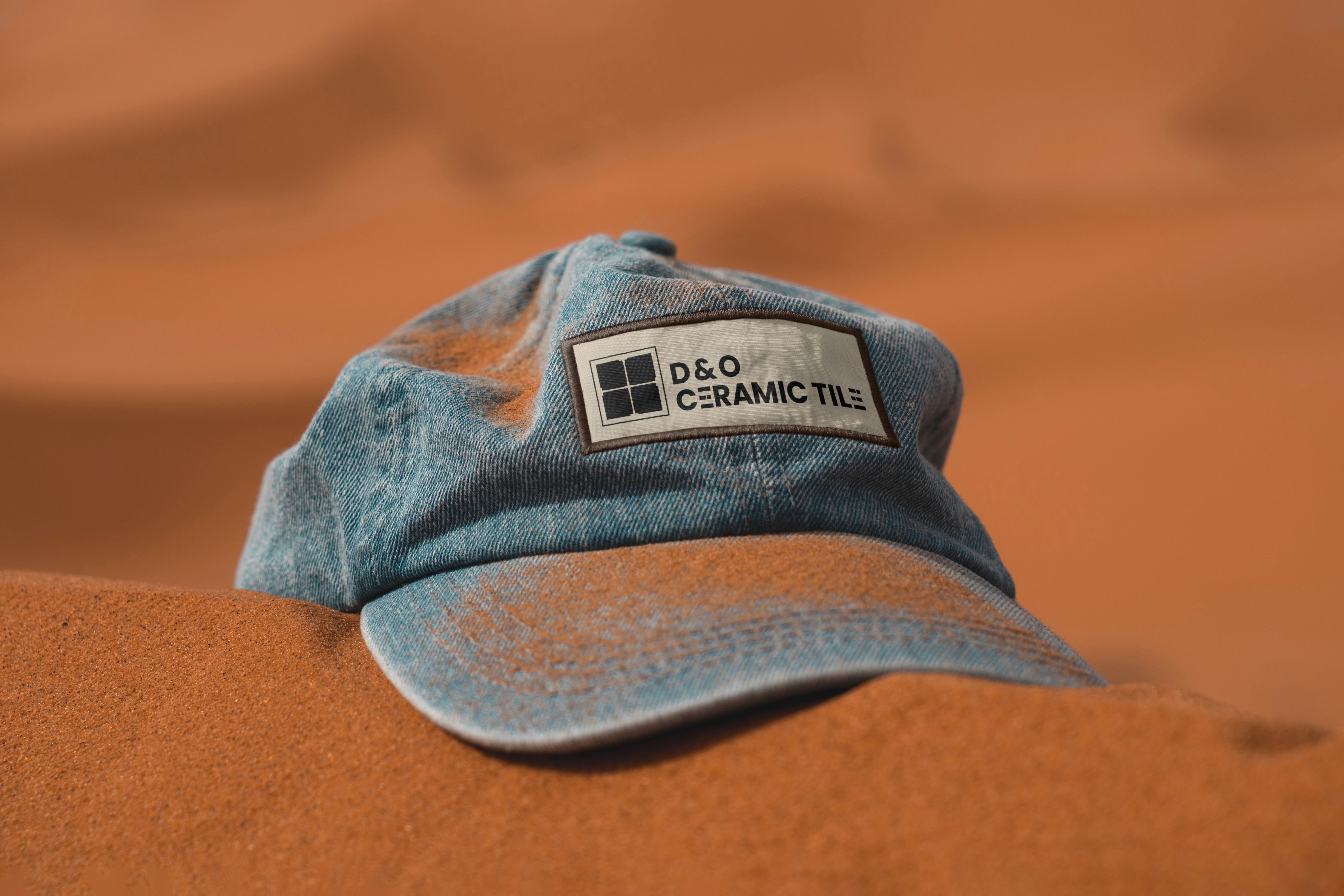
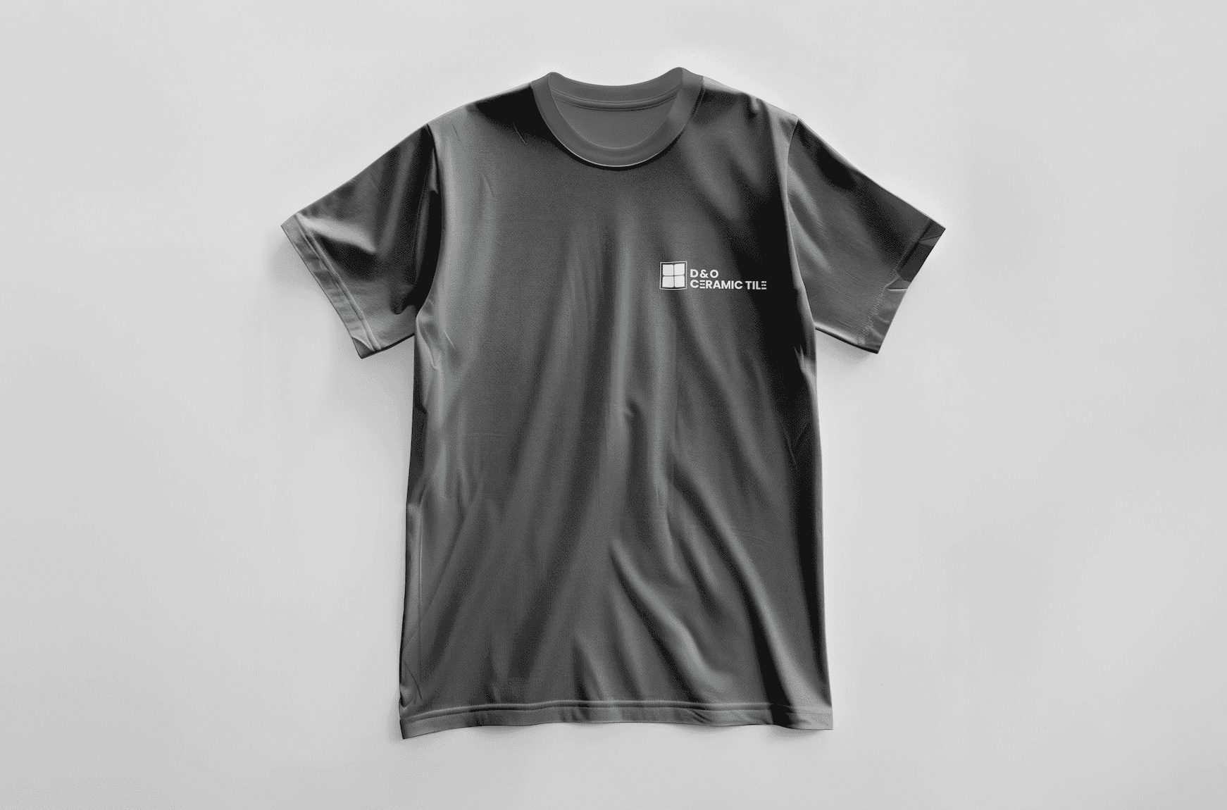
D&O specifically wanted a new logo that was versatile, modern, and timeless, opting for a simple black-and-white design to ensure greater adaptability across all platforms.
The Process
In analyzing the original D&O Ceramic Tile logo, I identified a few key areas for improvement:
The tiles were hidden behind the text, which diminished their visual impact and disrupted the overall cohesion.
The text lacked distinctiveness, making the logo feel less memorable.
The logo's reliance on a black box limited its versatility and adaptability across different applications.
To give the typography a unique touch and strengthen its connection to D&O’s work, I made custom adjustments to the kerning and redesigned the "E." I based this modification on the 33% rule in tiling, a key element D&O frequently used in their installations.

With these insights in mind, several iterations, and intensive research into industry trends, I developed a logo that incorporated square tiles and tile spacers in the logo mark.
This was symbolic of the company's craft and gave the logo a distinctive and personalized touch.

Huey Health Solutions
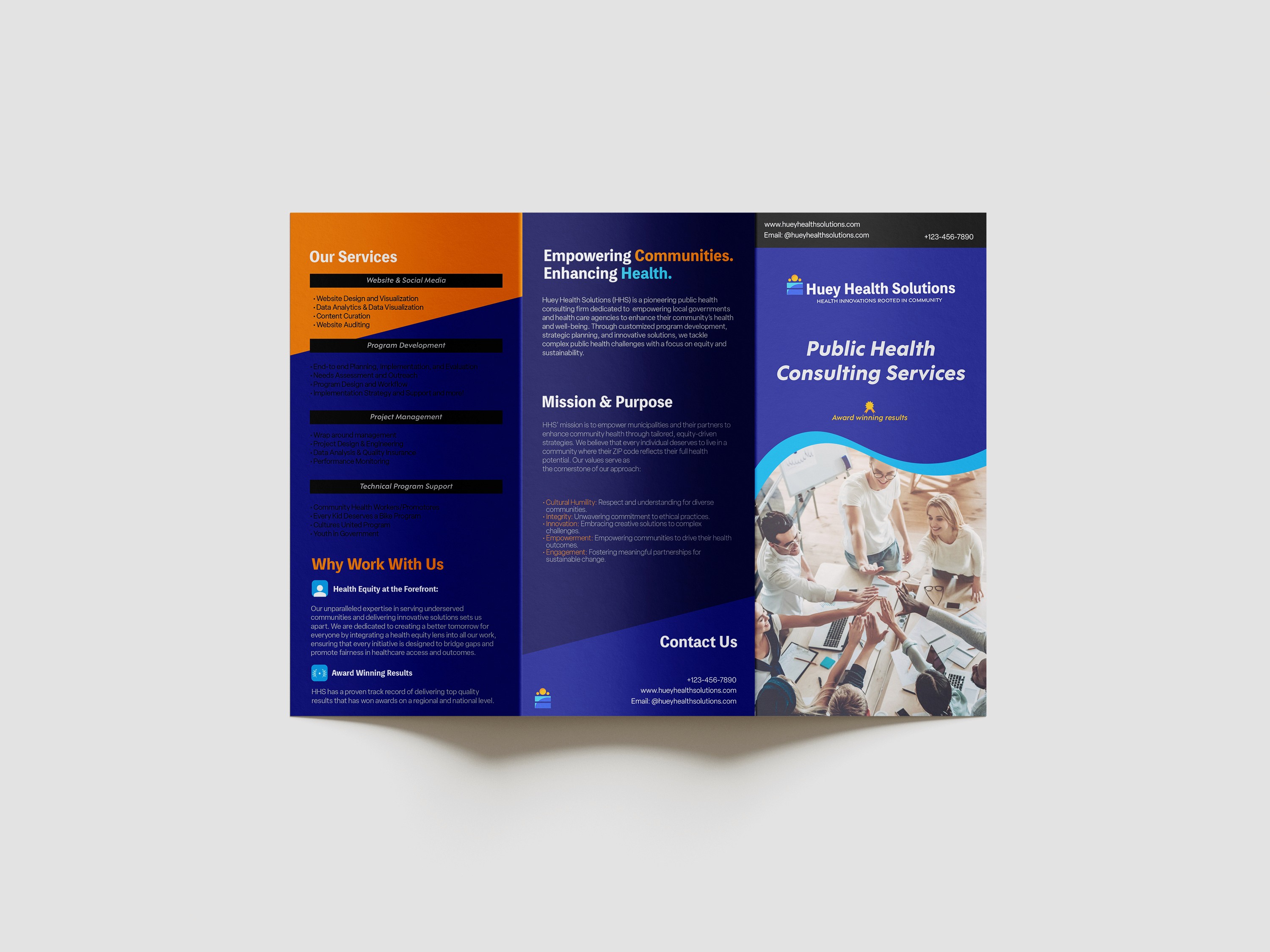
Huey Health Solutions is a pioneering public health consulting firm dedicated to empowering local governments and communities to enhance their health and well-being. Through customized program development, strategic planning, and innovative solutions, Huey Health Solutions tackle complex public health challenges with an emphasis on equity and sustainability.
As a new consulting firm, Huey Heath Solutions sought a visual identity to feel approachable amongst their potential clients, while adhering to their mission and values.


The Process
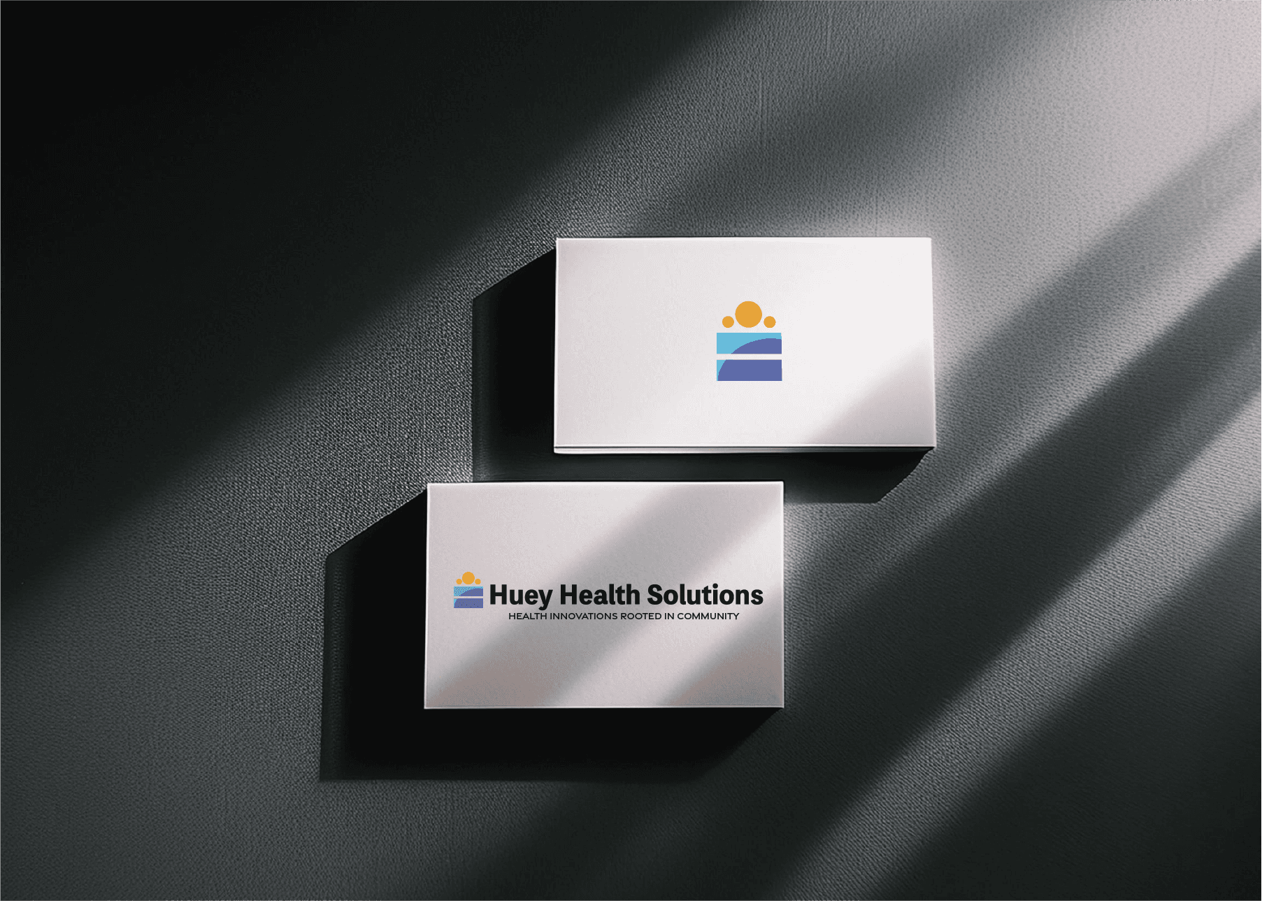
During the research phase, I noticed that many health-focused organizations used a simple, universal icon of people—represented by a circle for the head and basic body shapes.
I wanted to incorporate this recognizable symbol into the logo, using three circles to represent community and unity. To highlight the value of equality, I included an equal sign at the base of the logo. Reflecting the belief that every person deserves to live in a community where their health potential is not defined by their zip code, the logo visually captures the connection between Huey Health Solutions' mission and the communities they serve.